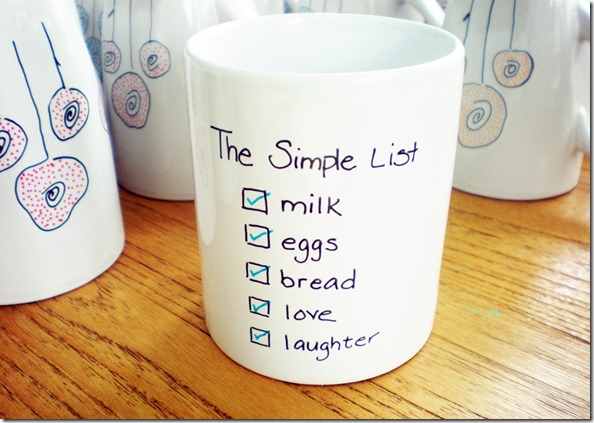
I’ve been working on a wholesale order and prepping for a local Craft Market that I’m super excited about. After printing many of my Simple List Towel I got the idea that it might look really sweet on a mug. My initial thought was a very simple, clean, black & white aesthetic like my Rise Drink Shine mug. But then I toyed with the idea of adding a small pop of color by using a color called Peacock Blue for the check marks. I like it but I’m just not sure. What do you think?
So here is where you all come in. I’d love your creative input:
- Would you keep it all black & white or add the pop of color with the check marks?
- Do you like the blue for the check marks or should I keep the pop of color red like in the Simple List Tea Towel?
3. How about adding red stripes to somewhat mimic the tea towel?
4. Should I just leave it as is?
As always, tell me what you think in the comments below. Thanks for the slight diversion from printing, and packaging but it’s time for me to get back to it.
live SIMPLY, live LOVELY


Hmmm that's tough. I'm not loving the blue, but I do think a pop of color would be nice. So maybe red... I'm leaning towards red stripe(s) like the towel.
ReplyDeleteEverything you do is so great! It's hard to answer the question! hehehehe!
ReplyDeleteI vote for the blue pop of color and the red stripes on the towels. Love little surprises of color :)
ReplyDeleteI love the blue, but if you changed the checks to red it would be more cohesive with the tea towel and you could easily package it as a "gift set" if you wanted to. ;)
ReplyDeleteThank you so much ladies! I absolutely love reading what you have to say and processing all the feedback.
ReplyDeleteKatie-I love the idea of a "gift set". I have it in the plans to do some type of gift set geared towards weddings, with the towels, mugs and possibly the eggs. Haven't worked out all the details yet. I think you are right about keeping the look cohesive so I am leaning towards using red either in the checks or stripes like the towel. I will have to play a bit which is always so much fun.
I'd love to hear more comments so keep them coming! :)
I like the blue! I also think the stripes would add more visual interest.
ReplyDeleteLooking forward to seeing you soon!
I like both the red and the peacock for the checks. I think keeping the mug as is - with no added stripe element - is more in keeping with the "simple". The towel and mug are both fabulous!
ReplyDeleteJust checked out your shop on IShopIndie and I love, love, love your work!
ReplyDeleteLike that blue very much but if you change the red one - that could be a gift set with towel. So maybe you just make 2 versions - with blue and with red :-)))))
ReplyDeleteYou all rock!!! I can't wait to work on this gift set. I think I'm definitely leaning towards keeping the red consistant. Once I've had a chance to work out the design I will post a pic. Thanks everyone! :)
ReplyDelete